Being tired by the dominant influence of the international design, by the 1970s, modern designers began responding with new forms and artistic directions. One of the backlash responses to the international design was retro and vernacular design. Paula Scher was one of the representatives who fell back on a freedom given by the inclusion of old influences. In 1979, Scher began applying the traditions of Cubism, Dadaism, and Constructivism in some of her artworks because it allowed her to make do with typography, rather than more expensive images that her employers could not have afforded then. Seeing an expressive quality of typography Scher continued to widely use it in her work for many years. The “Language Is a Deadly Weapon” graphic and a series of posters for the Public Theatre are very different visually due to the usage of child-like manner in the former image and an ascetic black and white color combination in the latter. However, in both pictures Scher relies on typography and uses a word as an image. I chose particularly these images because they show the artist’s fascination with typography in different time periods and in different styles.
Together with Louise Fili and Carin Goldberg, Paula Scher revived the long-forgotten typefaces and influences of historical art movements dated from the early twentieth century. Mixing bold forms and peculiar types of Constructivism and Dadaism allowed Scher to expand a set of her design techniques and gave her more freedom in her graphic designs. In the 1994 graphic “Language Is a Deadly Weapon,” Scher uplifts typography on par with photography and illustration and “moves [it] to center stage to become figurative, animated, and expressive.” In the 2009 poster for the Public Theater’s productions of Twelfth Night and The Bacchae, Scher’s reliance on typography conveys energy and the spirit of unconventional.
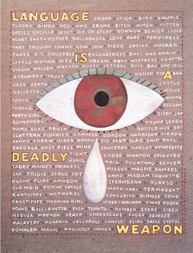
In 1994, for MTV’s “Free Your Mind” campaign, Scher created a graphic called “Language Is a Deadly Weapon” (fig. 1). The artist relies upon the force of typography and uses images sparingly. Unlike other computer-generated images of that period, the “Language Is a Deadly Weapon” poster is hand-painted on paper. The image has a background of handwritten words which are slang and insulting names for women. The name of the poster refers to the effect dirty words have on women intensified with a tear coming from a large red eye. In “Language Is a Deadly Weapon,” Scher uses an original approach to color and texture and intentionally draws it in a childish style. It probably unites her with the Cubists who preferred to depict “signs rather than representations of the subject matter… [t]he essence of an object and its basic characteristics, rather than its outward appearance.” The approach is similar to Dada’s rejection of the existing canon. By using this childish uneven handwriting Scher wanted to underline a personal reaction to the problem of bullying and harassment. The childish handwritten quality also unites her with Expressionists who had “the tendency to depict not objective reality but subjective emotions and personal responses to subjects and events.” Leaving the idea of aesthetics aside, the artist concentrates on color and texture. To emphasize tactile properties, Scher chooses course paper and bold contours for letters. The handmade quality alludes to Russian Constructivism that reacted against czarism and underlined its own poverty. To better express her idea Scher uses a word as an image, and it is also a reference to Constructivsts who tried to express the new era of Communism through the rejection of old forms and figurativeness.


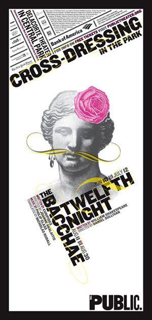
In the Public Theatre posters, created when Scher worked for the Pentagram design studio, the artist steps away from stylistic references to retro designs but she lives the spirit of Dada. The 2009 poster for the Public Theater’s productions of Twelfth Night and The Bacchae is a poster for a theatrical event, so there is no underlying message to convey, like in the above mentioned graphic. In it, Scher uses typography purely to communicate the location and time of the Public Theatre production but at the same time, the diagonal rules hint at an unorthodox character of the event. To emphasize the unconventional character of the performance, Scher allows herself an allusion to L.H.O.O.Q., Marcel Duchamp’s parody of Da Vinci’s Mona Lisa (fig. 3). In this work, Scher paints long moustache to the ancient Greek statue, Venus de Milo, and decorates its head with a rose. The poster’s layout has a visual clarity and seems simply arranged. However, an expressive use of type betrays Scher’s constructivist approach. Diagonal rules give rhythm and break to the monotonous combination of black and white. The injection of pink adds energy and gives a modern feel. In general, the color combination looks clean and modern, and it is in stark contrast with Scher’s 1990s works when she heavily draws on retro styles including the use of color.
Get a Price Quote
In the “Language Is a Deadly Weapon” graphic and a series of posters for the Public Theatre, Scher heavily relies upon typography for its expressiveness. Additionally, the inspiration from earlier historic styles gives a freedom of expression and expands the range of designer means. The artist allowed her fascination with the force of typography to play a major role and often made choices in favor of letters, rather than images, or used images sparingly on the background of words and texts.
List of Figures

Fig. 1. Paula Scher, “Language Is a Deadly Weapon” graphic for MTV’s “Free Your Mind” campaign, 1994.

Fig. 2. Paula Scher, poster for the Public Theater’s productions of Twelfth Night and The Bacchae, 2009.


